510 JOURNAL OF THE SOCIETY OF COSMETIC CHEMISTS terms of pigment mixtures. Quality control during manufacture may be very simple in the case of coloured cosmetic products, but it is worth re- membering that quality control by chart methods is only possible when the product can be measured, in this case in terms of chromaticity: the more sensitive the measurement of chromaticity, the earlier the detection of deviation in quality of product. COLOUR ATLASES It is also desirable to mention the nature, possibilities and limitations of colour atlases. A complete colour atlas contains samples of surface colours which cover the whole possible range, and are displayed in some sort of logical manner for ease of reference. In a good colour atlas, the spacing of the colours follows a uniform, reproducible perceptive scheme. With sufficient patience, a logical array of colours can be set up: the Munsell atlas is one of the best, and best known. The colours are so spaced that each is at a perceptually equal distance from each of its neighbours. Unfortun- ately, no atlas can be used for accurate measurement by comparison of an unknown coloured surface with the "chips" of the atlas: adequate repro- ducibility and permanence are not attainable except by doing so many and such frequent measurements that the atlas loses its point. One might as well do the measurements without the atlas. All the same, atlases have their uses, especially when the colours are arranged at equal sensory intervals, as in the Munsell atlas. In so far as design of cosmetic colour schemes is possible, the arrays of equally spaced colours of an atlas provide ideal material for the purpose. The aesthetic and psychological factors of colour harmony, colour contrast, colour rhythm, etc., may be explored with facility, using the atlas chips on various backgrounds, which may be larger specimens of the atlas colours. The details of such aesthetic and psychological factors are outside the scope of this lecture and are, indeed, extremely difficult to investigate: a great deal of work has been rendered futile through ignorance of the known facts of colour perception. It behoves any would-be investigator to make himself thoroughly familiar with these facts before embarking on his aesthetic or psychological journey. ILLUMINATION AND COLOUR So long as an illuminant looks more or less white it is easy to assume that it has no particular importance in the perception of the colours of

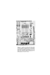
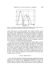
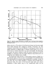
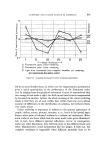
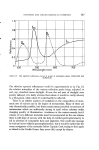
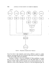
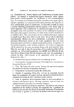
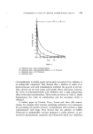
EYESWEET AND COLOUR SCIENCE IN COSMETICS 511 150 I00 5O Figure 10 Spectral energy distributions of daylight and a fluorescent lamp designed to imitate it. The sharp peaks due to the mercury lines and the strong deficiency in the deeper red should be noted. objects seen by it. The advent of the fluorescent lamp was the great single factor which disturbed this complacent attitude. Previously, the only commonly noticed effect was the difficulty of matching the darker blue or purple materials in artificial light: it became second nature to go to the nearest door or window where there was some real daylight. The advantage was partly the greater intensity, partly the greater proportion of blue in daylight by comparison with the tungsten filament lamp which used to be almost the only artificial source of light. The fluorescent lamp provides a much greater amount of light for a given electric input, so that it is easy to rival daylight levels of illumination, but unfortunately the spectral energy distribution is peculiar, as may be seen from Fig. 10 in which daylight is compared with the light from a fluorescent lamp. The colour of the fluorescent light itself, seen when it illuminates a white surface, may be very satisfactorily white, but the
Purchased for the exclusive use of nofirst nolast (unknown)
From: SCC Media Library & Resource Center (library.scconline.org)